Saturday, June 5, 2010

Assignment #8


Technique: Wood fired, stoneware I think with some wheel-thrown and some handbuilt pieces. The bowl looks like it might be slab built.


Critique: I aspire to make pottery like this. At least that was what I thought when I first saw these pieces. The artist has a background in piggybank making which might be the reason these pieces have such wonderful feet. The feet are really interesting in the way they corkscrew/spiral from the base. It is a shame that our kiln had so many problems and that I did not find these pieces until finals week; I would have liked to experiment with making feet like this for a slab piece.

The second thing I like is the decoration on the bowl. The design is abstract but distinctly evokes ferns/leaves. I think what I have gotten out of this class is that sometimes it is not as important to accurately portray something like a leaf or a wave or whatever in the design of a functional peice, but to attempt to make something that is beautiful on its own. I haven't really seen my own pieces come out yet but I am already much more satisfied with the ones that have a more abstract or loose representation of leaves that those that were painstakingly made to look like a real leaf. There is one exception to this in the model assignment, which I am very proud of my pear, however that is all it is, a representation of a pear not a pear design on a bowl.

Truth be told, I like all my pieces and have really enjoyed making them. Maybe I will have an opportunity to do it again:)

Monday, May 31, 2010

assignment # 7


*NOTE* Pictures can be viewed better by clicking and viewing them in isolation.

Source:This piece is made by Elizabeth Prince, who maintains a blog called "gone to pot" and is sold on esty.com.

Technique: Slab-built with a white clay fired to "stoneware temperature" (does this mean low fire, cone 6???). The glaze is a sparkly blue or red that was topped with glass from a cleaned wine bottle which melted in the kiln.

Critique: What first drew my attention to this bowl/tray was the sparkly bottom. From the artist's description the inside of the bowl is smooth, however; the glass pieces give a crackling look that provides visual interest. I really appreciate that the glass was only put on the bottom of the bowl instead of on the petals or on both; the choice to put that crackle looking glass really conveys the look of a flower and the modified stamen/pistol which is at the center. I think this glass and glaze technique is cleaver because convinces the eye of a visual texture while still being smooth. Unlike a more textured piece, with little protuberances or holes, a smooth piece can be more functional as a vessel/tray.
I feel the color choices also affect the impact of these pieces. The blue bowl appears to have a light blue glaze beneath the glass whereas the red bowl has a white with a red border. I think the red bowls appear more washed out; the white center reduces the impact the sparkly glass that is more affective in the blue bowl.
The description of the pieces say the outside was deliberately kept unglazed to provide a contrast and to display the natural beauty of the clay. Are the bumps in the clay a groggy mixture? I assume that the grog is what adds to the strength of the clay, which the artist says is important for this delicate shape. Is that right? Is it easier to make delicate/thin forms with a more groggy clay?

Wednesday, May 26, 2010

Assignment #6


Source: emilymurphy.com

Technique: the pieces appear wheel thrown and some slab-work. The peices are then soda-fired. Her process is given on the site saying "After 12 hrs of firing, the kiln reaches around 2250′F... I add in a mixture of wood chips, water,calcium carbonate, soda ash & baking soda (yes, the Arm & Hammer kind). This mixture will burn and the soda will vaporize into a vaporous glaze. The vapor is carried on the flame throughout kiln and lands on the pots and glazes each piece."

Comment:

I am really smitten by these pieces. The first thing that drew me to them where their earth-tone colors and the depth that the glaze layering gives to a piece. The second thing that made me want to investigate more was the terms "soda fired" and "spray glazed". I had never heard of soda fired but looking at more soda fired pieces they really have a roughness. Where these pieces shine above the rest is the combination of glaze colors that layer simple primary colors (blue, yellow, red) without making it cheezy like clown colors or a baby's room; these are the most earthy, organic looking examples of primary colors I have ever seen! These pieces are amazing in their decoration, and what's more is that they are completely functional (and dishwasher safe to boot)!

Another thing that makes these pieces interesting is that they look like they have a great texture; the way the glazes play off each other and the soda ash can sprinkle itself on one part of the piece and not the other creates a really compelling form that you want to appreciate with your eyes but you want to touch it too, at least I do...

Finally, I was wondering what sort of kiln this person must have; maybe it is something custom-made for her needs??

Saturday, May 22, 2010

I went to Georgie's finally!


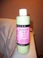
Well, I finally made my way into Georgies yesterday and left with some great stuff, or so I think. I ended up getting four glazes and one underglaze (pictured above in small squeeze bottle). Or at least that is what I thought...looking at my stuff now I see that the biggest bottle I purchased (pictured above), thinking it was a regular glaze is actually an underglaze. (crap!) Can I still use the underglaze I purchased and just put a clear glaze coat over it?

Despite this one set back I am really excited about the other glazes that I purchased.

One is called desert pine and is a really dark pine/olive color with burnt red hints in the spots where it was applied more thinly.

Another I got is a crackle glaze that is light green/seafoam; I think it will be a great addition to some of my slab-work that needs a little character, but that I don't want to overshadow with a bold color choice.

The third is called outerspace and is described on the label as a "crystal glaze". This is the coloring I wish to put on some of the bird birdfeeders I have been making. The glaze is almost a cobalt blue but with these sunbursts of yellowy-gold that just look amazing.

The last thing I purchased is a double ball-tipped tool. The tool looks very similar, and I assume it works in the same way as, a double ball burnisher used to smooth and shape amalgam fillings (hence photo above). In fact, upon further investigation the tool by Kemper is called a double ball stylus. The biggest difference I can see between these two tools is that the dental burnisher is angled.

All of these items I will bring to class on Thursday and hopefully I can use all of them! :)

Wednesday, May 12, 2010

assignment # 5


Source: Georgie's website/newsletter (http://www.georgies.com/enews/2009-09-24.htm) All three are being shown at Georgie's gallery. Artist: Patrick Brame.

Critique: I decided to post all three of the pictures on Georgie's newsletter page because I am curious how they were made. First the fish and reptile skeleton (?) pots look like they might be terra cotta but I'm not sure. they all look wheel thrown rather than hand built. What I am most curious about is the crackling on the first pot.

I really like the fish and reptile skeleton pots. I think this taps into my association of pottery with cultures of the past. There is a roughness to these pieces, which are charming. The subject matter, the clay, and the coloring all tie into an aesthetic that is organic and in some cases explicitly tied to a longing for the past. The skeleton in particular is undoubtedly a representation of a fossil, a literal remnant of the past.

Even though I describe these pots as having a "roughness" to them that is not to say they are simple or of lesser artistic quality, but rather, is a comment on the artist's choice to not embellish the pots with a high-gloss glaze or elaborate color scheme. The skeleton theme is something I had not seen before but is probably one of the more logical things to be coming out of clay; out of the dirt.

bird birdfeeder


This photo is the inspiration for my bird-shaped bird feeder. Looking at it more I see that the hollow area follows the contours of the bird's wings, or rather, the area where the wings would be.

It's amazing that the same basic idea can become two distinct forms; so far the birds I have built still are not as functional as this one appears to be. Both forms I have made seem to miss the point, with the open area being more on the bird body.

What I have learned from my attempts so far is that this project is easier done by making a solid form, then hollowing it out, rather than building around the cavity with coils. Using this aforementioned method I will attempt a last bird. My plan is to incorporate the opening into the visual space where the wing should be, as I have discussed, and also to enlarge the opening compared to my previous forms for more functionality.

Tuesday, May 4, 2010

assignment #4


Source: This picture accompanies a how-to article on HGTV's (Home and Garden Television) website that describes the process of making a gigantic teapot in a numbered step-by-step fashion. (http://www.hgtv.com/crafting/oversized-teapots/index.html)

Technique: Without divulging trade secrets, the article explains the general strategy to making this tea pot. First a sketch is made to not only flesh-out an idea for a piece but to estimate the amount of clay required for each segment. The clay and glaze is just referred to as "stoneware clay" and "stoneware glaze" on the materials list. A wheel is used to create the body of the vessel in two segments. The spout and handle are thrown while the decorative elements are hand-built. Everything is later assembled with finishing touches like thumb tabs and some of the decorative vines are added. The lid is wheel thrown.

Critique: This teapot it enormous! I'm not sure that the picture accurately informs the viewer of its girth but the instructions call for a 50" and 35lbs handle to be made. I find it odd that a form so connected with a purpose (serving tea) can be appreciated much more as a piece of art only when its practicality has been completely lost. Of course, art is not practical! With the amount of planning and material that must be dealt with to make this piece it is no wonder that this type of thing is a rarity; however, I can't help but think, "would this pot be less beautiful if it were of ordinary size?" If this were a usual-sized teapot it would probably not warrant a double-take; which reminds me of the documentary we watched in class that touched on the idea that perhaps the only when it is in use is pottery its most beautiful. If this idea is true then this teapot can never reach its full potential; I doubt anyone will use this kettle for tea, or do anything with it other than stare at it. The glaze is not extraordinary in capturing depths of color and the shape in general is generic for a kettle.
Upon my first look at this piece it occurred to me that this pottery is so American in a boldness for lack of an explanation that can be summed up by the saying "bigger is better"; however, as I think about it more, the piece may actually be trying to break through to the American viewer by calling attention to beauty in the mundane (the artistry in the everyday teapot), in affect, making this otherwise common-place ceramic object an unavoidable, gigantic, attention-hogging example of functional elegance, despite its obvious lack of functionality. The article that accompanies the picture does not delve into these "why" questions but instead satisfies the "how".